GTT
GTT
SaaS – IaaS Web Application
SaaS/IaaS platform similar to Amazon AWS and MS Azure.
The project:
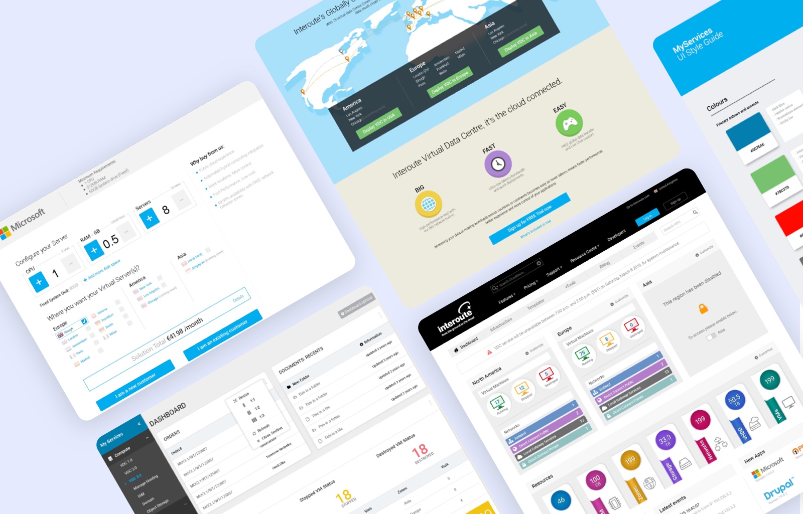
Design a SaaS/IaaS platform similar to Amazon AWS and MS Azure.
Goal:
There were existing platforms, but the business goal was to make it more efficient, user-friendly, and hassle-free so that anyone with little knowledge can use it, unlike AWS and Azure.
Our role:
We provided UX workshops and took lead on their key projects.
What we did:
We defined UX goals and strategy. Collaborated with usability research, analytics, consumer insights, A/B testing, engineers, and development teams. Conducted user research, usability testing, and held company-wide monthly UX workshops.
Result:
The platform was launched successfully after rigorous usability testing with real users. The best achievement was that we managed to attract users from other platforms, due to better experience.
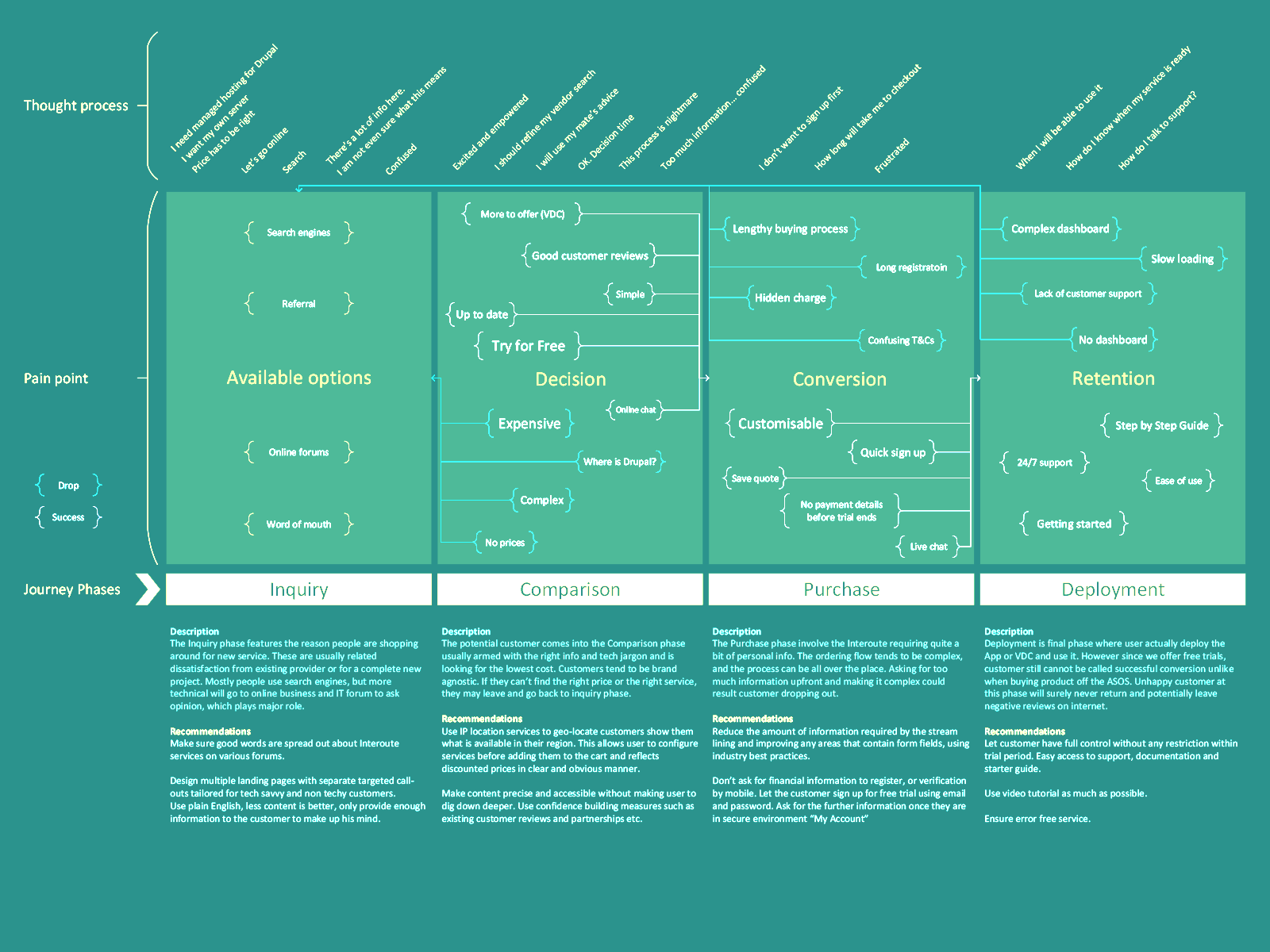
Experience mapping
Based on research, potential users, stakeholder interviews, and the users of existing competitor products, we came up with an experience map/journey, which gave us a clear picture of what users were looking for.
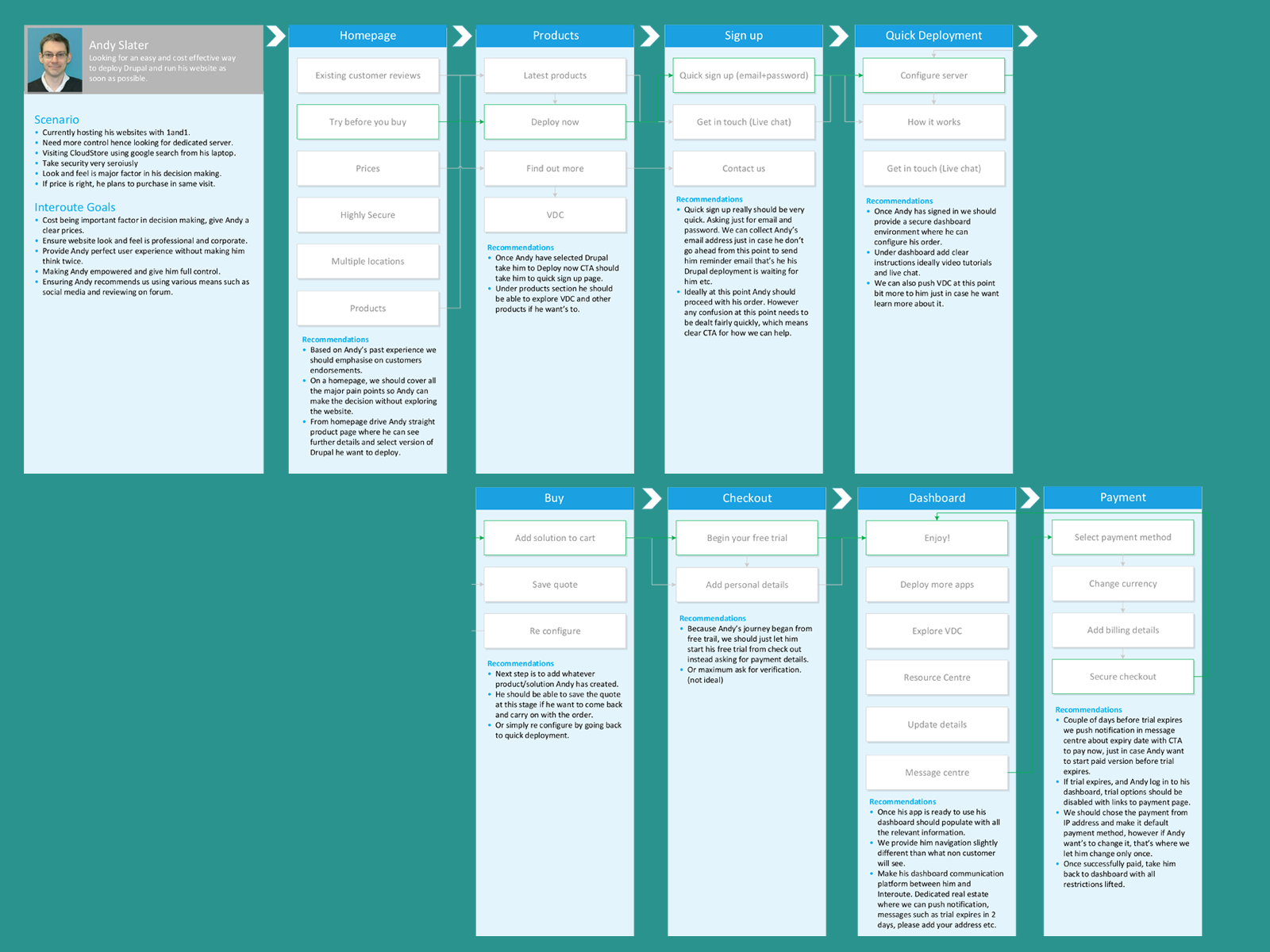
User journeys
Based on the personas, we created an ideal user journey. This journey was tested with multiple users and worked with the majority.
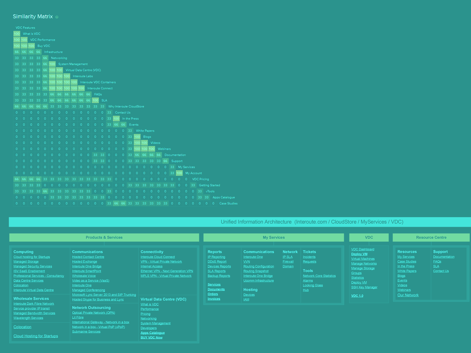
Information architecture
Completed the initial research, user information gathering, and foundations for the whole project. Our next step was to create the information architecture. We used card sorting exercises to get this done
The purpose of this part of the information architecture was to create flawless navigation allowing users to use the VDC and easily navigate to GTT’s other products and services.
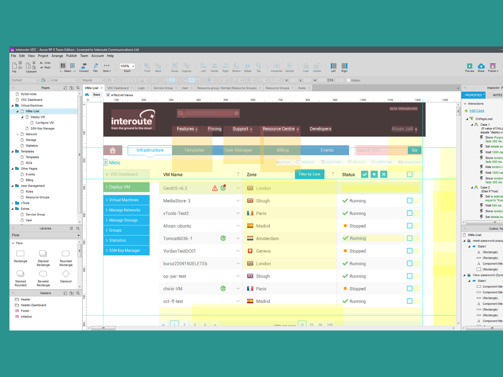
Prototyping/interaction design
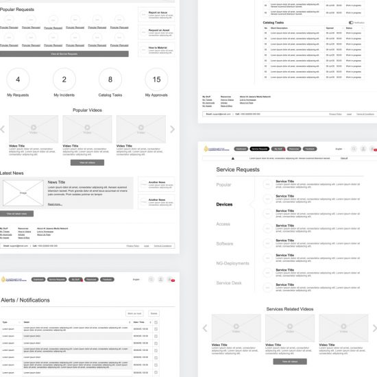
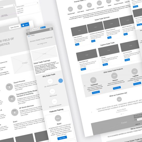
The most important part of the project was prototyping. We went to Axure straight from paper sketches. We had everything clear in our minds, so we went straight to high-fidelity prototypes.
This decision proved to be very successful as stakeholders and users were better able to envision the project outcomes with fully functional prototypes.
Usability testing
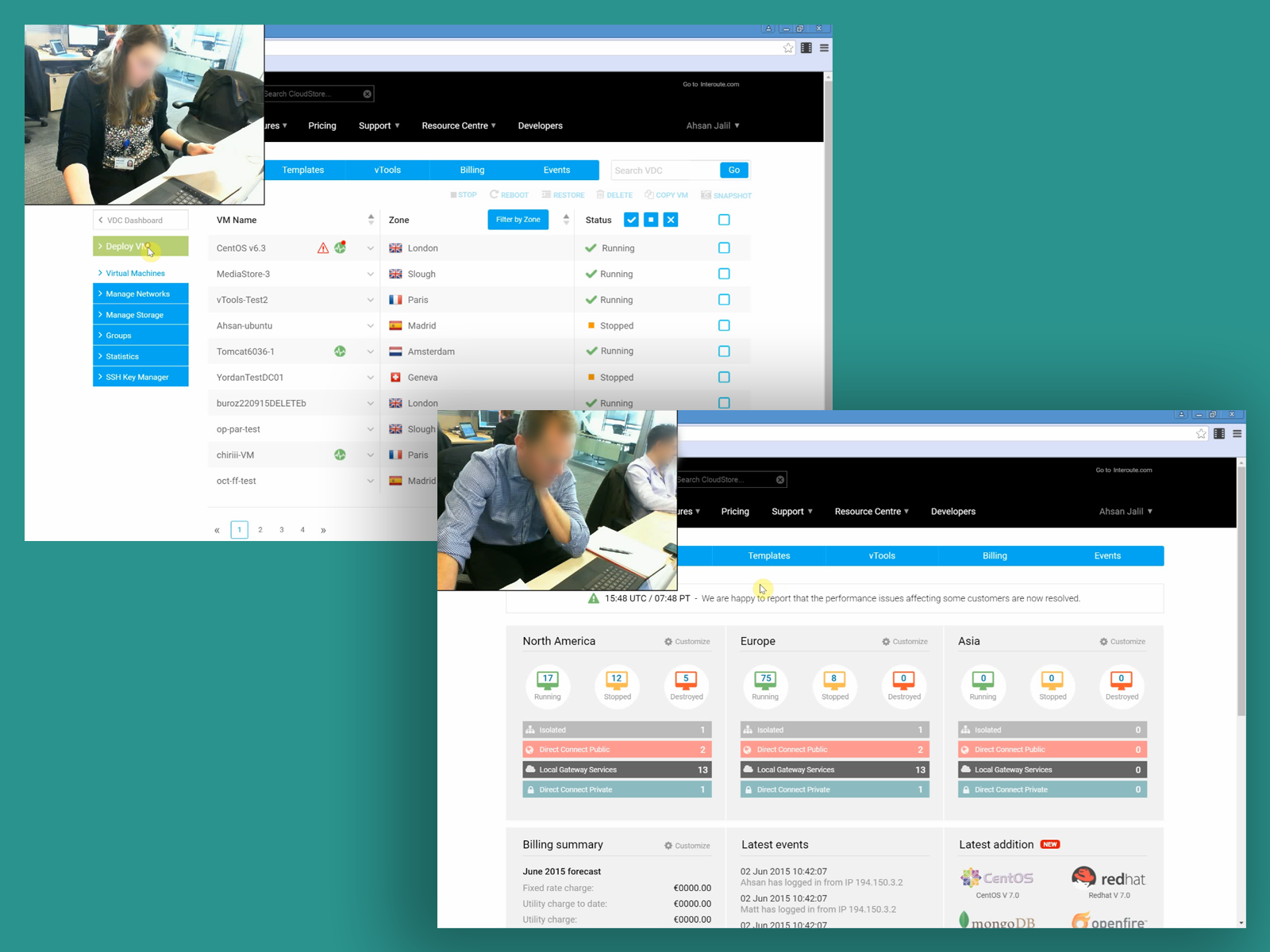
After the first prototype draft, we conducted usability and user testing sessions with internal and external users.
We presented users with set tasks and asked them to perform on the pre-set computer so we could record their screen, audio, and video. For the first session, We managed to test nine users, which pointed out valid points. These were then improved and retested with the same and new users. This exercise was done a total of four times before we reached an approval rate of 80%.
Although We kept taking notes on paper after the usability test, we presented every user with a short survey to compile their response as a data form.
Style guidelines
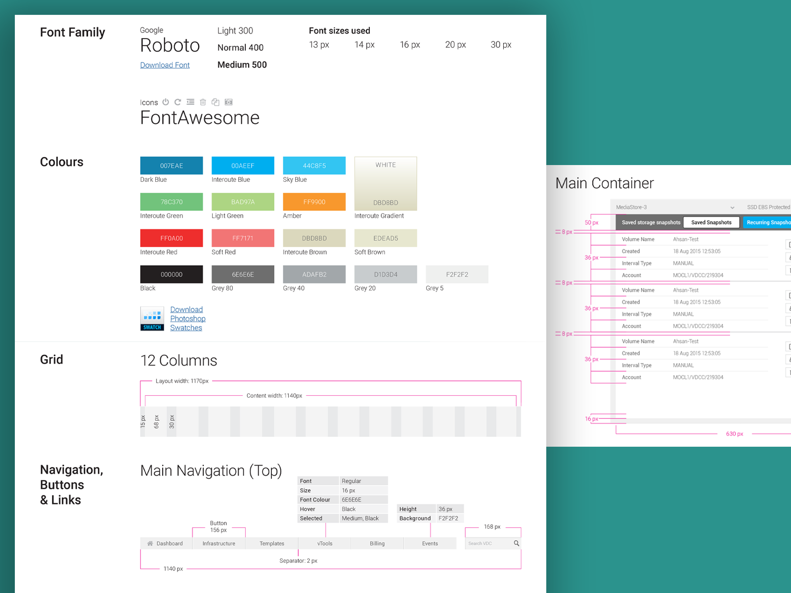
To help developers and external partners working on the project, We created style guidelines based on GTT brand guidelines. That helped greatly to keep everything consistent throughout the GTT digital experience.
UI design
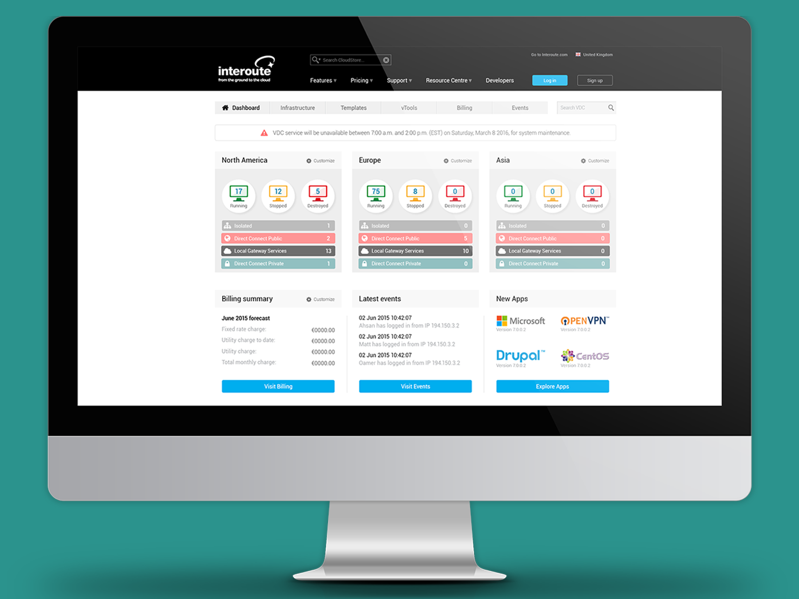
It took months to complete user and usability testing due to the complexity of the project. Once completed, We were ready to move on to the UI portion.
Many things in the prototype were kept similar, but in the UI, we choose Google Material Design, plus some additional items which were created in-house.
We constantly had meetings with developers to ensure that the UI was not proposing something which may pose challenges to developers and delay the launch
Info
IT Service Management and SaaS, UX
November 23, 0216
